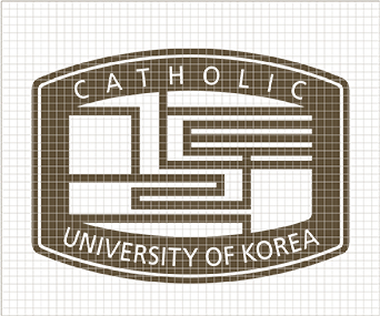
Symbol Mark
The Catholic University of Korea's UI harmoniously blends straight and curved lines to convey a sense of restrained beauty, embodying the concept that "a Korean image is a global image." This modern reinterpretation of traditional Korean imagery reflects the vision of "the Catholic University of Korea leaping forward to the world."
Using "Intelligent Blue" as the primary color, it employs blue for an intellectual image and white for a clean image, with gray and silver as secondary colors. The blue symbol represents the university's image of youthful and progressive growth based on deep traditions.
'The central "Catholic" grid pattern symbolizes the interwoven threads of a loom, representing interconnected cells. This not only implies the meaning of life but also expresses the harmony of tradition and modernity through the combination of the Korean word "Catholic."
Notes
- The symbol mark of the Catholic University of Korea is a registered trademark, and unauthorized commercial use is a violation of trademark rights.
- The form, color, and other elements of the university's symbol mark must not be arbitrarily altered,as such changes can distort the image and weaken communication effectiveness.
- The minimum size regulation for the symbol mark is established considering its reproducibility; using it below the minimum size is prohibited.
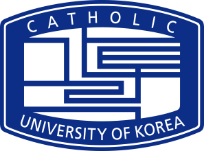
Basic Form

Usage Form
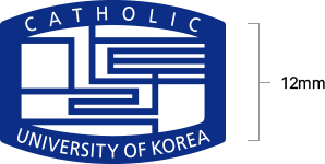
- For use between 8mm and 12mm, a specially designed mark without the outer line should be used, as shown below. The minimum usage regulation below is established considering the reproducibility of the symbol mark, and usage below 8mm is prohibited. An exception is made when the background is the Catholic University of Korea Blue.
Exception Rule
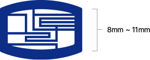
- For unavoidable use below 11mm, a specially designed mark without the outer line and the text "CATHOLIC UNIVERSITY OF KOREA" should be used, as shown below. Usage below 8mm is prohibited.
Symbol Mark Grid
The symbol mark of The Catholic University of Korea is a fundamental element of the University Identification System (UIS), serving as the key representative symbol in all visual communications to express the university's image both internally and externally.
The symbol mark, developed to ensure visual image consistency, fosters unity among the university's members and consistently conveys the university's image to the outside world, requiring special attention in its use.
For large sizes that cannot be output by a computer, the symbol mark should be accurately constructed according to the provided grid.
Symbol mark only colors
The Catholic University of Korea Blue
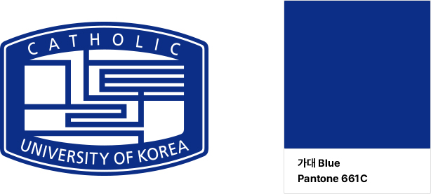
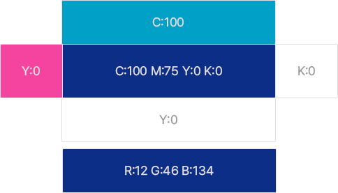
The exclusive colors of the symbol mark are another critical means of differentiating The Catholic University of Korea and must be used in strict adherence to color regulations.
The principle of spot color use should be followed, though four-color process printing may be used depending on the medium (newspapers, magazines, etc.).
When following four-color process regulations, significant differences in brightness and saturation can occur. Therefore, comparing with color samples to achieve the best standard colors is necessary, and when specifying the original color for the medium, Pantone Color numbers should be used.
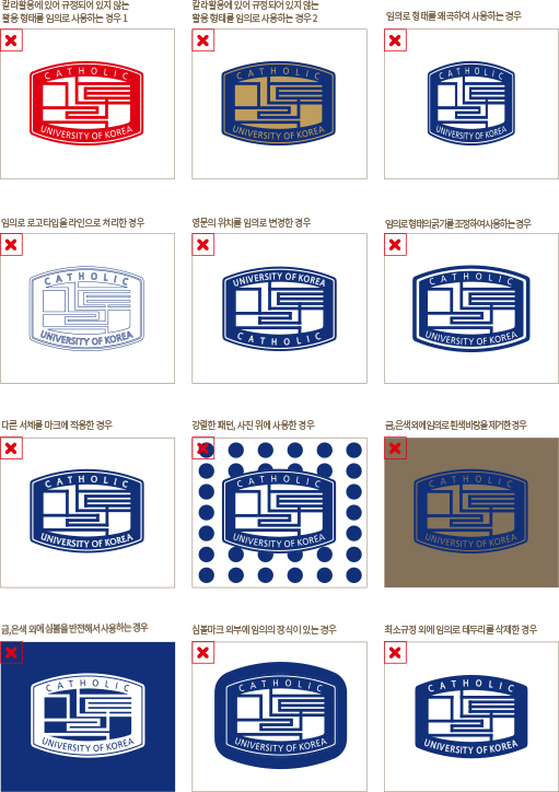
Misuse of the Symbol Mark
Using the symbol mark in arbitrary shapes or colors, as shown in the examples below, can cause confusion about the university's image and is strictly prohibited.
Korean Logotype